Providing professional and affordable Web Design and Development since 2010.
AJSMEDIA™
BASINGSTOKE
T: 01256 411 936
M: 0 785 727 99 85
E: enquiries@ajsmedia.com
S: sales@ajsmedia.com
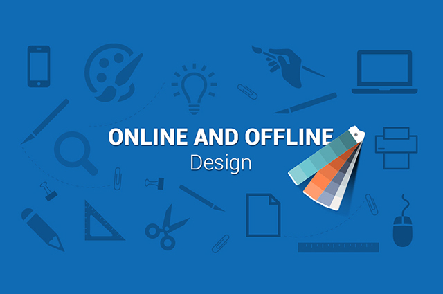
IS YOUR WEBSITE REPRESENTING YOUR
OFFLINE COMPANY?
Is your website representing your offline company?
Your website must accurately represent your business - you want users to look at it and understand your business on first glance.
There are two questions you should ask yourself:
1. When was the last time you looked at your company's website?
2. When was the last time you REALLY looked at your company's website? These really are two different questions I like to ask clients.
It is likely that you interact with your business website every day, but how often do you closely check every aspect? It is great practice to regularly put yourself in the place of a potential customer and consider what their opinion would be when they browse your website for the first time!
- Website Images
- A useful example to consider is a kitchen company that supplies fitted kitchens, and also offers an installation service. There could be two potential target markets for a company like this customers who want to spend over £10k on a new kitchen, or customers who want to spend around £3k on revamping their existing kitchen or utility. If this company decides they want to target the customers who are looking for a brand new kitchen, then the images on their website should reflect this.
- If they aren't displaying lots of pictures of high-end kitchens, then it can lead the customer to assume that they don't supply the type of kitchen they are looking for. Conversely, if this company decides they want to target customers who want to revamp their kitchen on a budget - then lots of pictures of high-end new kitchens will lead them to assume the product on offer is too expensive for them.
- Always remember how important the visual experience is to your customer. There is a good chance your images will have more of an initial opinion-forming effect on their decision than your written content. If they form the wrong first impression then you will have to work twice as hard to correct that elsewhere.
- Website Fonts
- Your website font also contributes to the visual experience a customer will experience when arriving at your website, in the same way as your imagery. If you have a premium product, then make sure your font choice reflects that - if you have a value option, focus your font in that way.
- For example:
* Comic Sans is a simple, basic font and is great for emphasising price-competitive information.
* Monotype Corsiva on the other hand looks very stylish and therefore gives the impression of exclusivity.
This would be a good font choice for emphasising a premium product. - Your Website Colours
- You should also ask yourself whether the colour scheme you are using on your website is tailored to your customer base. Tasteless, bright colour schemes tend to emphasise a value-for-money option. The thought behind this is being bold, standing out and shouting about the great value you are offering. On the other hand, subtle pastel colours lead your customer to think of a product being more high end, and more expensive. There are of course exceptions to all rules but this is a good general starting point to consider.
- Keep Your Customers In Mind
- The right images, fonts and colours to use on your website are the ones that display your product or service to your customer in the most accurate way. Always keep them in mind when you are making these choices after all they will be the ones purchasing from your business website.
- Now - go and really look at your website and check it is tailored to your type of customer, if it’s not then get in touch with my professional team and they will advise per your needs.


Featured Posts
-

Making the Most of Your Google Places
No comments -

A Beginner’s Guide to Google Analytics
No comments -

Writing decent ads for Facebook PPC
No comments -

My Explanation Of Internet Cookies
No comments -

Organic Approach to Search Engine Optimisation
No comments